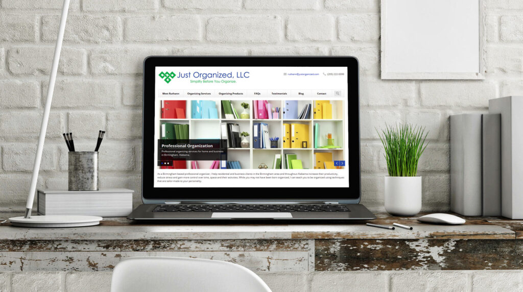
I have just updated my website. In doing so I realized that there are so many things to think about. I spent some time looking around the web and I found that there are some great sites, some good sites and some, well, not so professional sites.

Here are some common mistakes that I have seen lately.
- Not having your full name on your website. Potential clients want to know who you are, and they probably want to Google you and find out more about you from a source outside your website. Make it easy for them and include your full name on your website.
- Not having your contact information easy to find. Potential clients will want to connect with you through email, phone or text. Check to make sure that you have every way possible for a potential client to contact you. What’s more, make that information easy to find and use. Put your phone number as real html in your header so that a user can simply click the number to call from their mobile device.
- Location, location, location. Where are you? What area do you serve? Last year someone contacted me about working for them in Birmingham. From their address I could tell they were in Birmingham, Michigan. While I would love to travel to see them, I told them that I was in Alabama. They probably googled Birmingham organizers but left off the state. I don’t hide the fact that I am from Birmingham AL, and it should be obvious both to your site users and the search engines where you are.
- Pay for a Professional. I am not a website designer and have no plans to be one. Even when I was starting out in 1999, I paid someone else to make me look good. Why? Because you need a professional image. This is your advertisement in a busy and crowded marketplace. Write your own content (don’t steal from other sites) and use the professional you hired to tell you how to improve your message. They are your best sounding board; their talent is web design, and yours is organization. Stick to what you do best.
- Show off your credentials. Link them to the organization that awarded them to you. Let potential clients see that you have education, training and are up-to-date in your chosen field. Your credentials are what make you unique and different from the rest of your profession.
- Email Addresses. Okay, I know a lot of you are going to disagree with me on this one but don’t use xxxx@gmail.com or yahoo.com or any other free email service. Spend the money to look like you are a professional business owner. Nothing says I am an amateur more than a free email address.
